
White Castle 100th Birthday Logo
Anniversary identity system and brand standards guide for a 100-year-old brand.
Role: Designer
Focus Areas
Brand Identity, Logo Design, Packaging
Anniversary identity for a 100-year-old brand.
White Castle's 100th anniversary called for a full identity system that could hold up across a year-long rollout — packaging, retail signage, collectibles, digital, and print applications across 300+ locations. Starting from the White Castle creative team's concept of candles on top of the castle, I designed the anniversary identity system — flag banner, wordmark, burger-zero "100" treatment, primary and horizontal lockups — and wrote the standards guide that gave the marketing team, franchisees, agencies, and vendors what they needed to execute across every touchpoint.

A system built around a single starting idea.
The starting concept — candles on top of the White Castle mark — came from the White Castle creative team. From that seed, I designed the full identity system: the flag banner that holds the anniversary wordmark, the "100" treatment with the zeros stylized as sliders, the primary vertical lockup, and the horizontal and small-use variants.
The system had to work at every scale — from a pen imprint the size of a fingertip to a billboard visible from a highway. The burger-zeros were the hardest constraint to solve. At full size, they read as a clever tie back to the product. At small sizes, they had to remain legible as numerals. Every proportion, stroke weight, and clear-space rule I built into the standards guide was designed around that constraint.


The Identity in the Real World Applied across 300+ locations + Brand Standards
Wrote and designed the anniversary brand standards guide — the working document that gave the marketing team, franchisees, agencies, and vendors what they needed to execute the identity across a year of activation. Clear-space rules. Minimum sizes tested down to a pen imprint. Improper-use documentation. Typography pairings. Color specifications matched to the base White Castle brand.
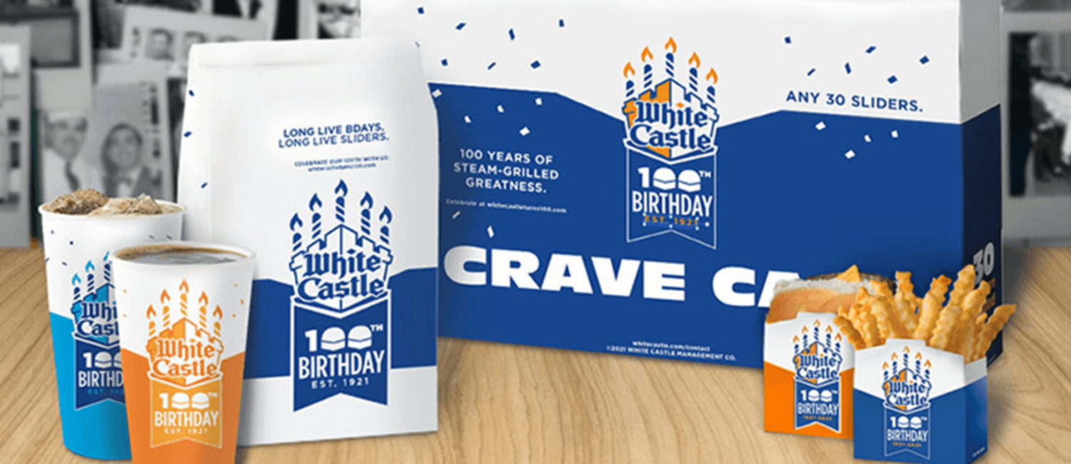
The anniversary program shipped across 300+ locations over the year, with the identity applied to Crave Cases, cups, sacks, coffee bags, mugs, retail signage, and small-format packaging. The packaging execution was handled by production teams working from the standards guide — the images here show the system holding up in the real world across every format, substrate, and scale it had to survive.
Marketing leadership, agencies, and production teams.
Worked directly with the Chief Marketing Officer, VP of Marketing, Brand Managers, Digital Marketing and Communications teams, and outside agencies. The identity system shipped across the anniversary year through the standards guide and the production teams who executed it.
What else we've built
Each one different. Each one deliberate. A growing body of work across brand identity, digital experiences, and motion design.